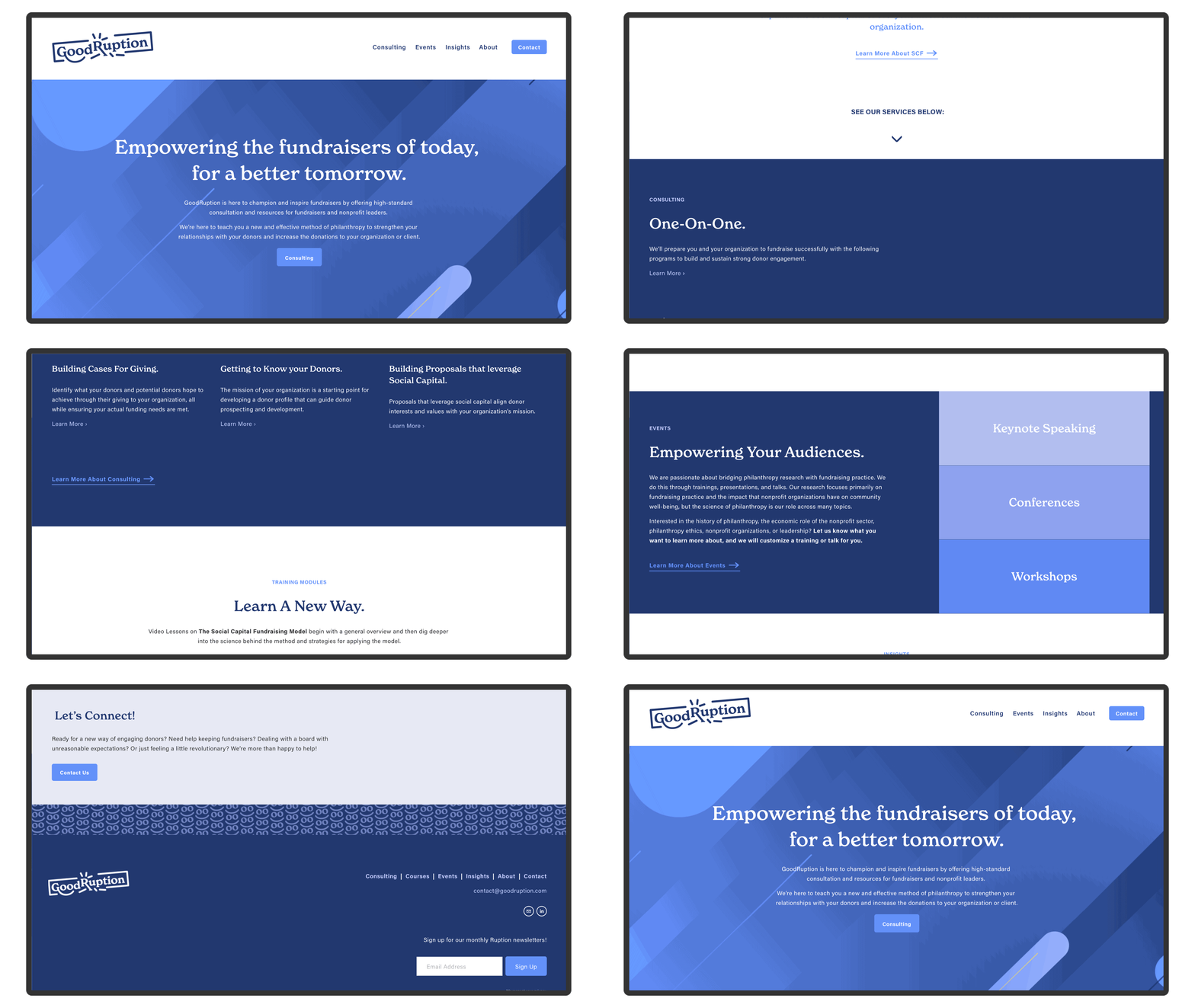
Including:
Art Diection
Content Strategy
Web Design
Naming
Branding and Identity
Tools:
Figma
Adobe (Ai, Ps, In)
Squarespace
Client:
Timeline:
2021 Jan-Aug
Overview —
GoodRuption’s purpose is to offer support and resources for fundraisers by providing a new model based on building Social Capital with donors. Kathryn Dilworth, the founder, has years of experience fundraising and a consulting business but wanted to expand to give back even more to her fellow fundraisers. She desired to build her brand and provide online courses, videos, articles, and more.
Together, we built a website and brand that does just that, catering to helping fundraisers better do their jobs and allowing Kathryn to share her valuable knowledge with others.
The Goal: Create a brand that represents a bold new model of philanthropy that fundraisers will love and love to be supported by.
Research —
Discovering the needs of the target audience, their missions in fundraising, and how they overlap with Dilworth’s mission was the first step to building GoodRuption. The audience was defined as three main groups: those in the library sector, those in the non-profit realm, and fundraisers with little prestigious help.

Users
The problems our audience faces:
-
Difficult for fundraisers to find credible and evidence-based methods.
-
Lack of clarity and depth for learning and incorporating new ways to fundraise.
-
Limited resources, difficulty to fundraise on the community level, and teach other members fundraising strategies.
Solutions:
-
Provide general and specific field-related training on the Social Capital Fundraising Model practice.
-
Connect fundraisers to research on fundraising.
-
Empower fundraisers by giving them tools to strengthen their voice and power.
Content Strategy—
After defining the overall strategy and goals, the next steps were to create a content map, a bottom-up information architecture plan, detailing the relationships between the content and how users will interact with it, then a basic content outline to guide the next phase: low-fidelity wireframes.

Content Map
Information Architecture
Content Outline
These documents and more went through multiple iterations, growing and improving parallel with each other. The goal was to make the content accessible and be presented in the best way to provide users the necessary tools, and to also convey Dilworth's passion for fundraising and desire to create a product for the sole purpose to help others.
Site Priorities
-
Frictionless Consulting Services
-
Accessible Courses and Video Lessons
-
Deliver Dilworth's Story of Empowerment
Wireframing —
Early rounds of wireframing were involved in ideating and experimenting with different layouts and further defining individual site pages' user and business needs. Mainly creating an effective and seamless consulting user flow was the priority for the website, as it would be the main source of income for the client. The secondary priority was creating the course section of the site. As it was the first time the client was seeing her content visualized, it allowed her to make alterations to better suit her needs and her audiences.


Wireframe Sketches & Notes
Low and High Fidelity Figma Wireframes:


Low-Fidelity Wireframes


High-Fidelity Wireframes
Branding —
Once the foundation of the business was laid, it was time to visualize what GoodRuption would look like and embody. Defining the Brand’s Ethos, Mission, Vision, and Purpose were the first steps of construction. After defining the variables, we brainstormed business names to encapsulate them. In the end, "GoodRuption" was chosen.
Good•Ruption
/ɡo͝od ˈrʌpʃən/
noun
-
Creating progress through internal and/or external change(s).
-
Disrupting the status quo in order to improve a situation and make the world a better place.
The Logo:
Rough sketches to capture any and all ideas, keeping in mind the brand values. After plenty of logo concepts, variations, and iterations, the final logo was established.
GoodRuption Logo Sketches

Primary Logo

Stacked Logo

Monogram Logomark
Breaking out of the box with a smile

New Beginnings
Happiness
Breaking the Staus Quo

Secondary Type
Primary Type

Color Palette
Visual Elements:
Additional brand elements include patterns, backgrounds, illustrations, and more. The goal of these additional elements is to create a cohesive and unified brand identity, allowing versatility in different applications while still remaining recognizable.

Patterns

Backgrounds

Illustration Style
Website —
The final site was built in the online web-building platform: Squarespace. This was due to its ease of use for the client to maintain and update on their own and because of its unlimited custom coding capabilities.

Applications —

Business Card
Digital Course Workbook

Podcast Cover Art


